컬럼형 레이아웃 - 블러그형 / float가 적합
마크업(markup)
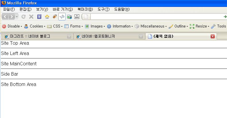
<div id="wrapper">
<div id="head">Site Top Area</div>
<hr />
<div id="sub">Site Left Area</div>
<hr />
<div id="body">Site MainContent</div>
<hr />
<div id="sidebar">Side Bar</div>
<hr />
<div id="foot">Site Bottom Area</div>
</div> |
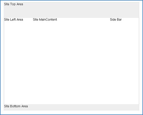
- 컬럼전체를 고절할 수 있는 블럭 하나를 만든다. ⇒ (#wrapper)
- side bar를 하나 더 추가한다.
- 렌더링시 기본 레이아웃과 커다란 차이 없음 (웹표준가이드(8)/css 레이아웃기초-2 참고)
CSS
|
body {
margin: 0;
padding: 0;
} |
브라우저 마다 body의 기본값을 통일시켜준다. |
|
hr {
display: none;
} |
각부분을 구분지어 주는 역활을 하므로
디자인상 화면에 나타나지 않도록 display:none; 시켜준다. |
|
#wrapper{
width: 700px;
border: solid 1px #eee;
margin: 20px auto;
} |
1. 컬럼 전체의 폭고정을 위해 사용
2. 화면을 가운데 배치하기 위해 ⇒ (margin: 20px auto;) |
|
#head {
height: 80px;
background: #eee;
} |
높이와 배경색 지정 |
|
#foot {
height: 30px;
background: #eee;
} |
높이와 배경색 지정 |
|
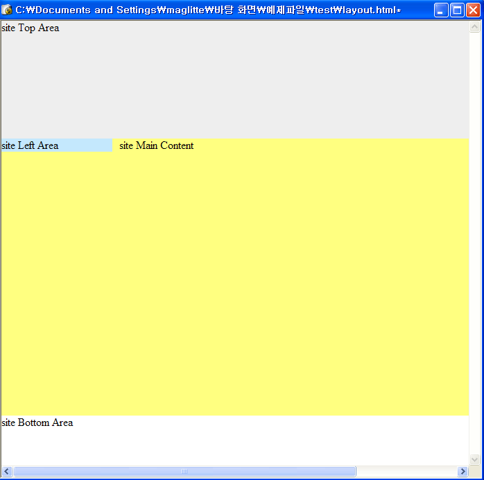
#sub, #body, #sidebar {
float: left;
} |
Site Lefr Area, Site Main Area, Side Bar를 모두 왼쪽으로 띄운다. |
|
#sub, #sidebar {
width: 150px;
} |
|
|
#body {
width: 400px;
height: 450px;
} |
|
|
#foot {
clear: both;
} |
float 된 블록 다음에 오는 엘리먼트는 clear: both시켜서
전체모양이 일그러지지 않게 한다. |
| float 시킬때는 항상 width나 height를 지정해 주어서 확실한 영역을 만들어 준다. |
<결과>
float를 이용하여 레이아웃을 잡을 때 배경이 보이지 않는 경우 overflow: auto;로 해결
float를 이용하여 레이아웃을 잡을 경우 배경색이 나타나지 않아 다른 엘리먼트를 추가하거나 컨텐츠 속성을 이용하곤 했다.
이는 아래 보이는 float된 div의 하위 엘리먼트 ul의 내용이 없을 경우 높이를 0으로 취급하기 때문이다. 이는 overflow: auto를 사용하면 쉽게 해결할 수 있다.
<div id="articles">
<ul id="notice">
...
</ul>
<ul id="news">
...
</ul>
<ul id="stats">
...
</ul>
</div> |
#articles {
width: 700px;
margin: 20px auto;
background: #ddd;
overflow: auto;
} |
overflow: auto;적용으로 배경색을 표현할 수 있다.
만약 overflow: auto; 미 적용시 화면에 아무것도 나타나지 않게 된다.


